
How Our Software Helps Fix Accessibility Mistakes
October 13, 2026
Built-in accessibility checking is a shared feature across all of our products. Whether you're using our catalog, curriculum, handbook, or syllabus software, our accessibility monitor will regularly scan for accessibility errors and point you to how to fix them. Here are four examples showing how it works.
1. Improper Heading Structures and Formatting
A page might look organized visually, but that doesn't necessarily mean it's accessible. Using bold text or larger font sizes rather than proper headings can make it difficult for screen reader users to understand and navigate content. This also applies to tables, such as lists of your course offerings, or documents with inconsistent formatting.
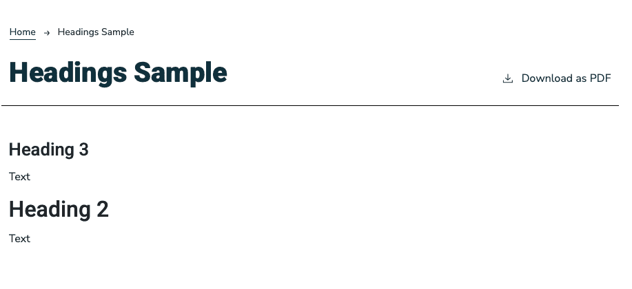 Sample page with headings out of order.
 The result for that page in our accessibility scanner.
How to fix it: Implement a logical heading hierarchy, properly labeled tables, and consistent formatting throughout your academic publications. These small adjustments help users parse, navigate, and find the information they’re looking for more efficiently.
2. Color Contrast and Text Readability
We Try to Prevent Contrast Errors Before They Happen
For most sites, you won't be able to select text colors that fail contrast standards, but our scanner will still check all pages just to make sure.
Institutional branding is important, but it shouldn't come at the expense of readability. Light-colored text, low-contrast backgrounds, and overly decorative fonts can make content difficult to read, particularly for students with impaired vision.
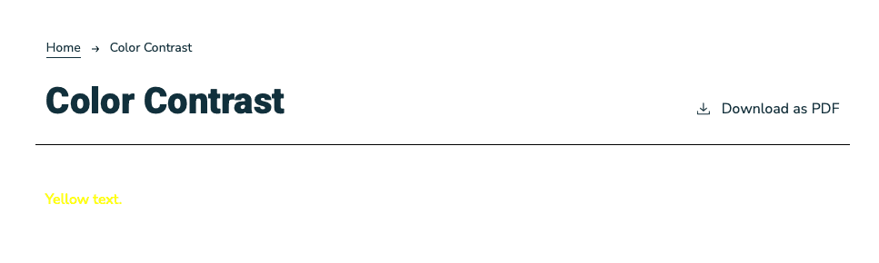 Sample page with poor contrast.
 How our accessibility scanner flags poor contrast.
How to fix it: Follow WCAG color contrast guidelines, choose legible fonts, and use proper spacing across all text. A great rule of thumb is to test your digital publications at different zoom levels to ensure content remains clear and readable.
3. Forgetting Alt Text and Accessible Images
Images are a great way to make academic publications more engaging, but without alternative text, they may leave some students missing important information. When images, charts, or graphics lack meaningful descriptions, screen readers may skip over that information.
Missing Alt Text Will Be Flagged On Upload
When you add an image to a page, our software will bug you to add alt text, but if you skip it it'll show up in the accessibility checker.
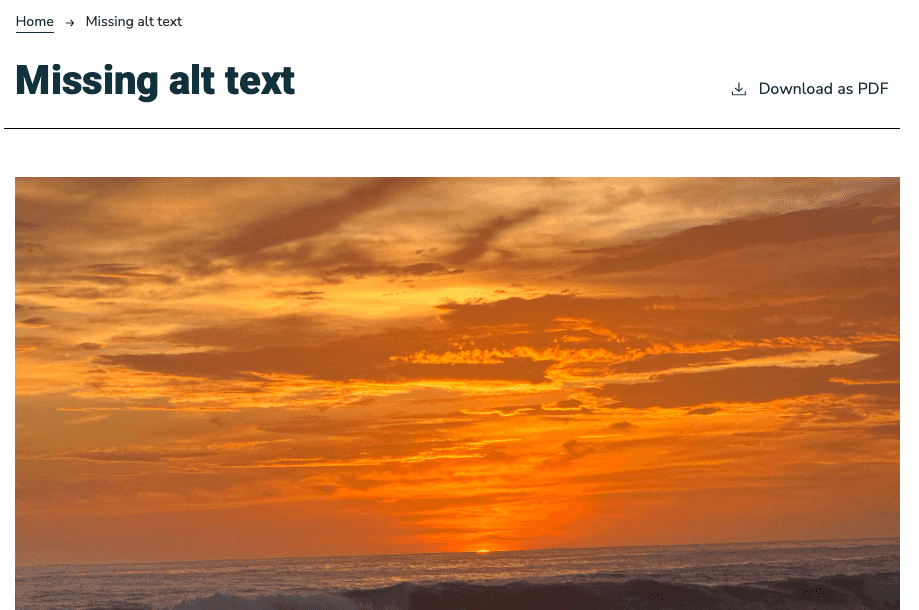 Uploaded image without alt text.
 How our accessibility scanner flags missing alt text.
How to fix it: Add descriptive alt text to all images and provide text alternatives for any charts or visual elements. Decorative images should be marked appropriately so assistive technologies can skip over them.
Treat Accessibility as an Ongoing Process, Not a One-Time Project
Our built-in accessibility monitor runs on a regular basis (usually every three hours), allowing you to fix accessibility errors as they come up. You can also run on-demand scans if you're prepping for launch and want to do a final check.
Ready to make your academic catalog more accessible? Schedule a demo to see how Clean Catalog can help.